Why Most Website Templates Feel Generic (And How to Fix Yours)

There’s always that sinking feeling you get when you’re scrolling down website templates, and they suddenly start blurring together. They somehow always use the same fonts, same beige tones, same “hello, here is my generic website that doesn’t clearly explain what I do, but at least it’s aesthetic and looks like my Pinterest board.” It truly makes you want to scream into the void, or maybe it’s just me.
Yet we keep blaming the templates, but in reality, you’re just not looking in the right places. Most website templates out there are designed to appeal to everyone, which means they appeal to no one. BUT when you start with a high-quality website template that’s actually built for bold, alternative brands, AND you know how to customize it? Complete game-changer.
So let’s break down what you actually need to make your website stand out.
You Need a High-Quality Website Template (Not Just ANY Template)
Not all templates are created equal. Most templates you’ll find are the standard corporate, beige, and built for the masses. They’re designed to be “safe” and “professional” (read: soulless and bleh).
If you’re an edgy photographer who does tarot readings during client calls or specializes in queer elopements, generic templates are never going to work for you, no matter how much you customize them.
A well-designed template gives you a strategic foundation that’s already doing the heavy lifting. The layout is optimized for conversions, the user experience is intentional, and the design has personality baked in. You’re not starting from a bland, generic structure and trying to force your vibe onto it, you’re starting with something that already feels bold and alternative.
This means you can skip the months-long custom build or the never-ending DIY project where you’re paralyzed by a blank canvas wondering where to even begin. Instead, you’re customizing something that’s already professionally designed and strategically built. You get to focus on making it yours instead of figuring out basic shit like where each canvas should go or how to make your services page actually convert.
You need to start with a template that’s built for YOUR vibe. One that already has a bold design, strategic layout, and an alternative edge. That’s your foundation.
You Need a Strong Brand Identity
Here’s where most people mess it up: they try to customize a website template before they know who they are as a brand.
Your brand identity isn’t just your logo and color palette. It’s:
- Your visual vibe (fonts, colors, imagery style)
- Your personality and voice
- Your values and what you stand for
- Your positioning in the market
Without this clarity, you’re just randomly changing colors and hoping for the best. And that’s how you end up with a website that still feels off.
I’ve heard so many stories about someone reaching out because they want to work together, but when they go to check out their website, it’s giving a completely different energy than their Instagram or their actual work. The disconnect is jarring. Their Instagram is full of intimate, emotional queer love stories, but their website portfolio could belong to any traditional wedding photographer. The branding doesn’t match the work, and potential clients click off the website immediately because they can’t tell if this photographer actually gets them.
That misalignment costs you bookings.
When you have a brand identity that’s rooted in your values, you can customize a website template to be completely unrecognizable from the original, in the best way possible. You know exactly which fonts feel right, which colors represent your energy, and which imagery speaks to your dream clients. You’re not guessing. You’re intentionally building something that finally feels like you.
You Need a Brand That Tells a Story
Templates give you the structure, and your brand identity gives you the personality, but storytelling is what makes people actually give a shit.
Your website shouldn’t just list your services; it should take visitors on a journey that makes them feel something.
When you really think about it, your dream clients aren’t just hiring you because you’re a good photographer. They’re hiring you because they feel seen by you, because your approach resonates with them, and because when they land on your website, they think “holy shit, THIS is the person who gets it.”
That doesn’t happen with a service list and some pretty photos. It happens when you tell them:
- Why you do what you do – What drives you? What made you choose this path? Why does photographing queer elopements or alternative weddings matter to you?
- Who you serve (and why you love them) – Get specific. Talk directly to the couples who break traditions, who incorporate tarot or astrology, who want their wedding to feel like them, not like a Pinterest board.
- What makes your approach different – Are you the photographer who brings sage to cleanse the space before a shoot? Who creates a playlist based on your clients’ birth charts? Who champions love stories that don’t fit the mold? Say that.
- How working with you actually feels – Is it laid-back and fun? Deeply intentional? A little witchy? Paint the picture.
When you infuse purposeful storytelling into your website template, using your unique brand identity, that’s when your website stops feeling generic and starts converting. That’s when people don’t just browse, they book. Because they’re not just buying your services. They’re buying into your whole vibe, your values, your energy. And if your website doesn’t communicate that, you’re leaving money on the table.
What This Actually Looks Like
Let me show you what’s possible when you start with a quality website template and customize it with a strong brand foundation.
Good As Hell Website Template
The Good As Hell template brings bold, retro energy with warm tones and an inviting design. It’s built for photographers and other wedding creatives who want to make a statement; think vintage-inspired fonts, rich colors, and a layout that feels like an experience, not just a portfolio. The structure works for any photography style, but the vibe is unapologetically fun and unique. It includes everything you need: home, about/team, experience/specialty page, gallery, contact, 404, and a full blog setup. This template gives you a foundation that’s already interesting, so when you customize it with your brand, it becomes something completely unforgettable.

Now, let me show you what happens when three different photographers take this exact same template and make it their own.
Natalescha Destination Wedding Photographer

Natalescha took the Good As Hell template and completely transformed it into something dark, moody, and luxurious. By swapping in a dramatic black and gold color palette, elegant serif fonts, and imagery that screams destination romance, they created a website that feels high-end and cinematic. The retro warmth of the original template is completely gone and replaced with sophisticated, editorial vibes that speak directly to couples planning intimate weddings abroad. They used the same structure, but it gives off an entirely different energy.
J Calls Photography
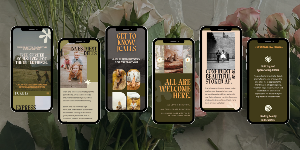
J Calls went the opposite direction, keeping warmth but making it earthy and grounded. They customized the template with muted olive greens, soft creams, and organic typography that feels free-spirited and authentic. Their photography features natural, light, wildflowers, and genuine moments, and the website reflects that beautifully. The bold retro elements of the Good as Hell template are softened into something calming and welcoming. You’d never guess it started from the same place as Natalescha’s site.
Loren Hansen Photography

Loren Hansen brought raw, edgy energy to the template. With a pink and black color palette, bold sans-serif fonts, and photography that captures real, unfiltered moments, the website feels rebellious and candid. The messaging is direct (“documenting what actually happens — not what Pinterest says should happen”), and the design matches that attitude perfectly. The warmth of the original template is still there, but it’s been reimagined as vibrant and unapologetic instead of retro and inviting.
Can you see the difference? Same template, completely different results.
The Bottom Line
Stop settling for generic, beige templates that were never built for your creativity in the first place.
When you combine:
- A high-quality website template (built for bold, alternative brands)
- A strong brand identity (that you’re not afraid to show)
- Purposeful storytelling (that connects with your dream clients)
You get a website that’s uniquely yours. One that converts. One you’re actually proud to share.
No basic bitches here! Just websites that represent the unapologetic badass you are.
Ready to see what’s possible?
Browse my Showit templates designed specifically for edgy, alternative brands that refuse to blend in. Each one includes all the essential pages you need (home, about, services, gallery, contact, blog setup), plus a bonus inclusivity statement site canvas, support guides, and tutorials to help you customize with confidence.
Your dream website is waiting.

NOTE: Trends evolve over time and some of our older blog content may no longer be up to date! Take note of the date at the top of this post and acknowledge that some things may have changed since this was initially published. :)


